 The World of SPLectrum
Noticing the Grid
Writing this looking back at the moment when the homepage showed me what it had become.
Ever since I started this website a few months ago I have been thinking about sections — adding boxes, moving things around, wanting each part to sit right. Suddenly it fell into place and I hadn’t put it there on purpose. The structure assembling itself while I was busy making practical decisions. This is about that moment.
It all started with a blog. I wanted to talk about my thoughts and findings. But I didn’t want it floating in the air — I wanted it backed by reference material. These were the early days of SPLectrum, when it started to dawn. In fact blog and reference started as separate entities, and were then joined together under splectrum.world. The two parts were under one roof.
But then I wanted the reference material to be well separated, each block self-contained. Soon I stumbled into the three-pronged approach: the core that I build from, the stuff I build, and the ‘prior art’. Thanks to human-AI collaboration I thought I would have enough capacity to bring ‘prior art’ sufficiently in-house to give the understanding needed for what I am building.
And so the three boxes were born — the reference site had become a proper site, clear separation, joined up with a conversational blog. I really wanted a blog that talks about happenings, conversations, no strings attached while the SPLectrum building gets erected.
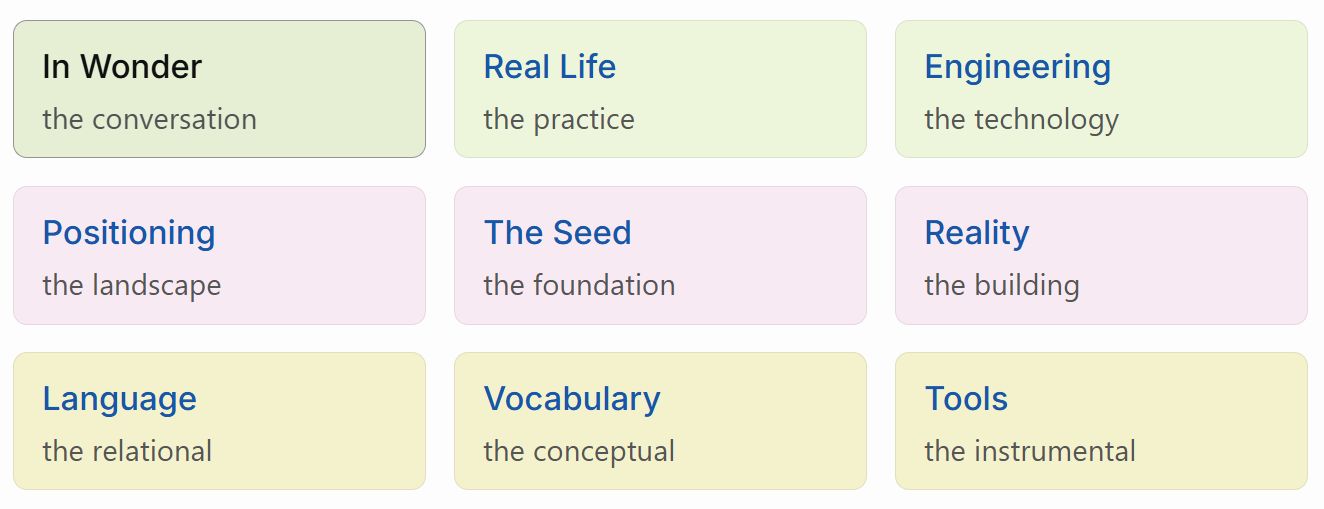
SPLectrum is all about language and meaning, the relational and the vocabulary, and I want this clearly visible as well. Suddenly a few more sections were born. And despite all the philosophy and science I want it to be about real life, what we do — in come the applied sections.
And then it was 3×3. Nine boxes on the homepage, three rows and three columns — on desktop and tablet at least, mobile doesn’t have the screen real estate and defaults to a linear list.
Primary axes are the rows: the foundation sits in the middle, the structural below and the applied on top. Notice that the blog has nicely slotted into the applied layer: there are the conversations, how it translates into real life, how it gets applied in technology.
The middle row is the heavy stuff — the foundation. At the centre are the seed principles of SPLectrum, the fixed reference point from where all journeys start. To its left the (outside) knowledgebase it draws from. I decided to bring everything I draw from inside with the right depth of coverage for what SPLectrum needs. To its right what SPLectrum builds from it.
The bottom layer is about structure — trying to make sense of vocabularies, and the interrelatedness of languages, all this requiring the right tooling.
With the seed at the centre the grid becomes a star. All is interrelated with its origin in the middle. Wow.
It’s tempting to claim I designed it this way from the start, but the honest version is that it designed itself through me. Relational coherence isn’t something you decide; it’s something you notice you’ve been doing.
And then there’s the reflexive bit, which I can’t quite let go of. The homepage contains a Real Life box. The homepage is itself a Real Life thing — a structural artifact produced by the worldview it presents. The grid doesn’t sit outside the structure it organises. It’s inside it. Self-including. The anti-foundationalist in me finds this satisfying; the pragmatist in me suspects it’s the kind of observation that matters exactly once and then you move on.
For the structural treatment — rows, columns, what follows — see The 9-Box Homepage in Real Life.
See also The 9-Box Homepage.